European SaaS brands raising US growth rounds carry a visual language that doesn’t land with US enterprise buyers. The fix isn’t to demolish it.
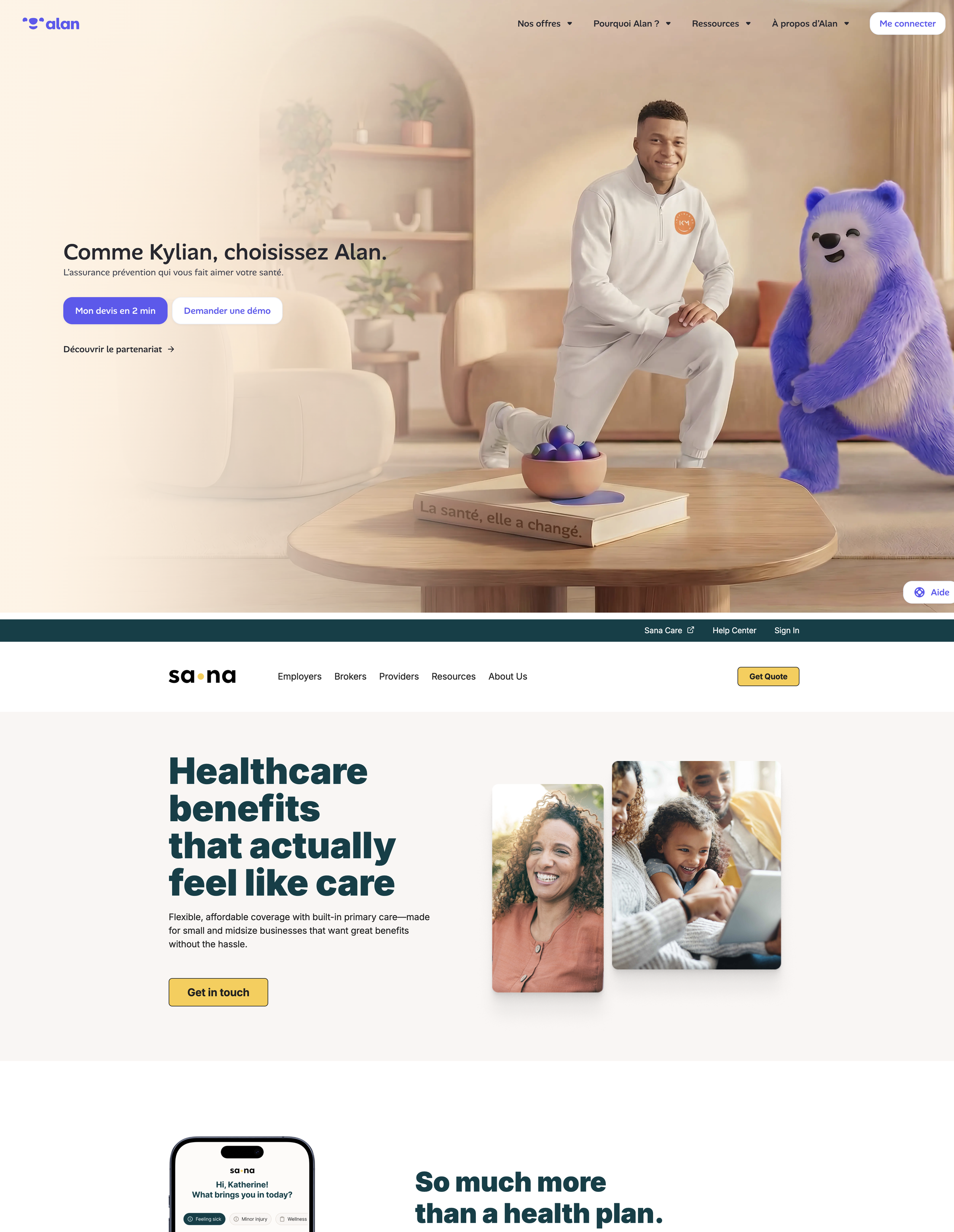
Pull up Alan’s site next to Sana’s.
Both are health insurance. Both want the same customer: an HR director, a benefits buyer, someone at a growing company with a spreadsheet of who needs coverage.
Now look at them side by side and ask which one a US enterprise buyer would actually trust with their team’s health.
It’s not the one with Kylian Mbappé and the fluffy indigo marmot in a styled interior. (Nice marmot, man.) It’s the one with the dark teal sans, the unposed customer photography, and the headline that just says “Healthcare benefits that actually feel like care.”
This isn’t a comment on craft. Alan’s brand is genuinely beautiful. The marmot is rendered with clay textures and soft fur. The interior staging is composed. The voice is warm. They got Mbappé. The work is good.
The work is also mistranslated. And this is the pattern worth pulling apart.
A US enterprise buyer’s eye is trained on a specific cluster of signals. Restraint reads as serious. Information density reads as honest. Unposed photography reads as honest too. Direct, benefit-led headlines read as adult. Clean geometry reads as professional. Cool neutrals or restrained dark read as trustworthy.
A European reader sees those same signals and reads them differently. Sparse density is suspicious. Restraint reads as cold. Unposed photography reads as stock or corporate. Direct headlines feel transactional. The European read of “warmth and humanity equals premium and modern” isn’t how the US enterprise eye is trained.
This is a culturally specific design dialect. Not better, not worse. Different.
The mistake is treating it as a quality problem. It isn’t. Alan’s brand is fine. The brand book is consistent, the system is well-built, the visual language coheres. The work is good in its native context.
The problem is that the native context doesn’t travel.
Picture the actual evaluation. A US benefits director pulls up alan.com next to hioscar.com and sanabenefits.com in three browser tabs. They aren’t reading carefully. They’re snap-judging the brand for fit, the way you snap-judge a restaurant by glancing in the window. Within five seconds, the brain has decided which of the three feels like a fifty-million-ARR enterprise vendor, which feels like a startup, and which feels like a wellness blog. The decision happens before any of the actual product gets evaluated.
What the US benefits buyer reads when they look at Alan:
A marmot mascot. Is this for kids?
A footballer endorsement. Is this a consumer product?
Pastels and rendered interiors. Doesn’t look like a fifty-million-ARR enterprise tool.
A conceptual headline. Less direct than my current vendor.
Same brand. Opposite reception.
Pull this pattern apart and what makes a brand read as “European” isn’t any single element. It’s a cluster.
Illustration where the US leads with UI screenshots or unposed customer photography. Composed editorial scenes where the US uses real moments. A warm muted palette where the US trends toward cool neutrals or restrained dark. Display serifs where the US sticks to system sans or proprietary typefaces. Conceptual headlines where US headlines are direct, benefit-led, and full of numbers. Whitespace where the US prefers information density. Character mascots and human warmth where the US chooses geometric restraint. Multi-language as default where the US operates English-first.
You can do every one of these well, individually, and still produce a brand that lands wrong in front of a US enterprise buyer. The signals stack.
Here’s the part that should keep European brand teams up at night: the category has noticed, and the category is responding.
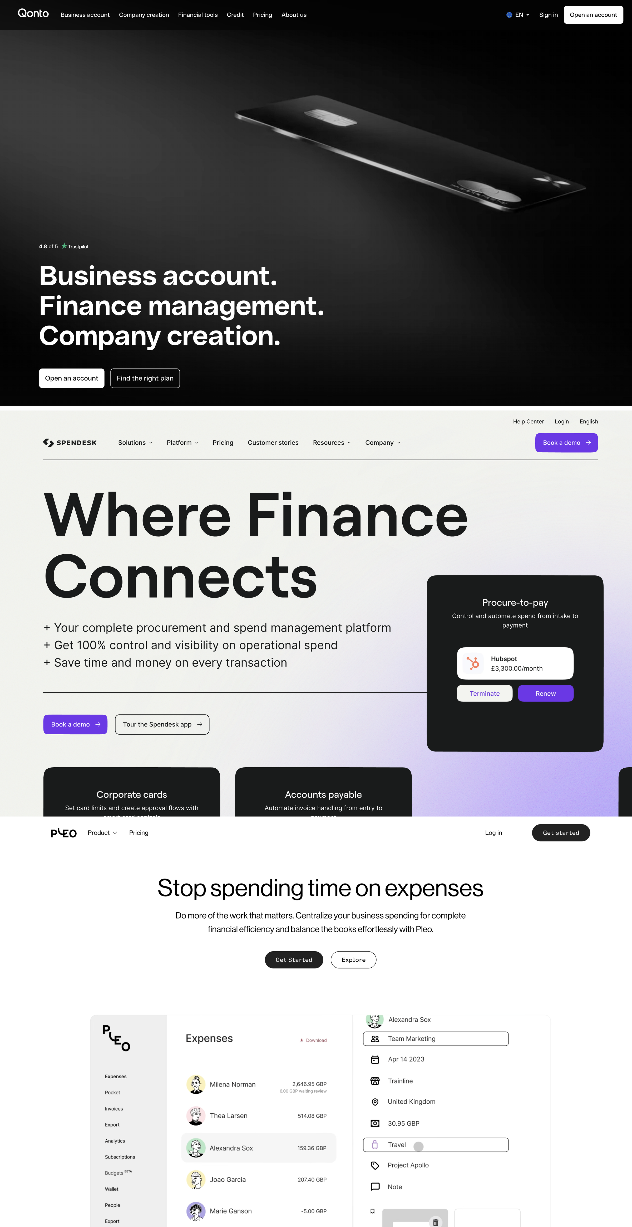
In February 2025, Qonto rebranded. They threw out the Lee Woodgate illustration system, the Alexander Coggin flash photography, the warm muted palette, the multilingual brand book. Koto built that system in 2022 and it was widely admired. Three years later, it’s gone. The current Qonto homepage is a dark gradient with a sleek device floating on it and a bold sans-serif headline that says “Business account. Finance management. Company creation.” Same company. New brand. Indistinguishable from a US fintech.
In late 2024, Spendesk made the same move. Their Head of Brand Design moved the brand from “playful, illustration-based” to “photography-driven, more sophisticated, more authentic.” The internal brief used the words “premium” and “mid-market.” Translation: they wanted to look enterprise to US buyers.
Pleo is taking a softer route. They kept the smiling L character mark and the illustrated avatars in their product UI. But the homepage hero has gone clean: white space, refined sans, type-driven. The character is still there, just deeper in the brand. Demoted from front door to detail.
Three brands. Three responses to the same perception problem. All three are losing something.
This is where motion comes in. (Yes, we run a motion studio. We know how that sounds.)
Most of the suggested fixes are violent. Strip the illustrations. Swap the palette. Change the typeface. Hire a US agency to redo the brand book. Qonto and Spendesk did this. Pleo half-did it.
It doesn’t work the way the brand teams hope. Not because it can’t (Qonto’s new brand will read as enterprise to a US buyer just fine) but because it asks you to throw away the thing that made your brand work in the first place. Your customers in Paris and Madrid liked the old brand. The brand was doing real work in your home market. Demolishing it to suit the US buyer is a bad trade.
Motion is a softer translation layer. It can preserve the spirit of a brand (warmth, character, point of view, color, type) while updating the visual language that signals “enterprise serious” to a US buyer.
Look at Mercury for what US warmth done right looks like. Mercury isn’t a European brand. They’re a US business banking startup. But their current “More than Banking” campaign, an atmospheric still life of a desk on a misty mountain, refined typography, structured grids, proves you can read as warm and read as enterprise at the same time. Warmth doesn’t require character mascots or conceptual headlines. It requires care.
For Alan, where the brand is so character-driven that the static illustrations are themselves the issue, motion can lean somewhere different. Translate the warmth without leaning on the marmot. Pacing, easing, soft transitions, gentle reveals. Keep the spirit. Lose the cues that don’t read as enterprise.
For Pleo, where the smiling L is too good to throw out, motion can let the character live in product walkthroughs and in-app moments while the homepage stays restrained. Same character. Different surface.
For Qonto, the moment to do this softly has passed. They went the other way.
The work isn’t about choosing between European and American. It’s about giving the brand a parallel motion language so it can read correctly in both markets without throwing the brand away.
A few things follow from this.
If you’re a Head of Brand at a European SaaS company funding a US push, the question isn’t whether your brand is bad. The brand is fine. The question is what your motion language is doing in the US, and whether it’s doing the work your static brand can’t do for you.
For most European SaaS companies, the answer is that the motion language is the static brand, animated. Same illustrations, in motion. Same character mascots, walking. Same warmth. Which means the motion is doubling down on the cultural reading instead of translating it. Or, increasingly, the motion is just the demolished brand, animated. Same outcome, from the other direction.
The translation layer is its own discipline. It needs a studio that reads US enterprise visual language natively and reads European brand work natively, in both directions. It also needs a structural fit, since asking a European finance team to onboard a US vendor for every piece of work is friction the brand decision can’t afford.
This is the gap. The work for the next decade of European SaaS in the US isn’t bigger brands. It isn’t violent rebrands either. It’s parallel motion languages that let the brand show up correctly on both sides of the Atlantic.
If you’ve been sitting with this question internally and not naming it out loud, this is what you’ve been sitting with.
If your European SaaS brand isn’t landing with US enterprise buyers, let’s talk about what motion can do.
Find the mistranslation